Comfort Color Trends for 2021
Sherwin Williams new Living Well Collection.
Color Trends for 2021
Since most of 2020 was spent in and around our homes, the colors we surround ourselves with in 2021 will be at the forefront of our thoughts, emotions and our mental wellbeing. The quickest and most affordable way to create or define our own space at home is to paint a new, fresh color on walls and ceilings. Whether it be one room or two, each space supports the need for comfort and individualism, while honoring the sanctity of home and safety. In 2021 we will see comforting colors from an array of companies who all have a similar focus in mind: emotional wellbeing.
Pantone®
Pantone released its two colors for 2021 - PANTONE 17-5104 Ultimate Gray and PANTONE 13-0647 Illuminating, a sunny yellow. Together these colors symbolize happiness and strength. The gray is a solid, everlasting color that is familiar and combined with the bright, cheery yellow embodies optimism and the need to feel that everything is going to get brighter – essential to the human spirit following a tumultuous year of anxiety and uncertainty. Recently, Pantone released its fashion color trend forecast featuring cheerier and sunnier color trends, a “warm marigold, serene cerulean blue, and an optimistic yellow. Infused with a genuine authenticity that continues to be increasingly important, colors for Spring/Summer 2021 combine a level of comfort and relaxation with sparks of energy that encourage and uplift our moods,” said Leatrice Eiseman, executive director of the Pantone Color Institute.
Benjamin Moore®
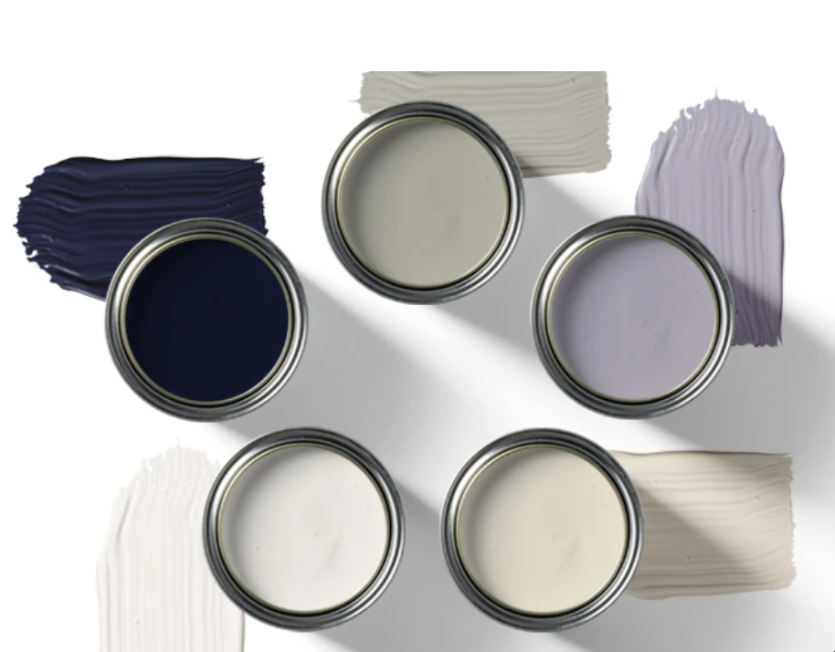
A few of Benjamin Moore’s color palette for 2021
Benjamin Moore color for 2021 is Aegean Teal, an intriguing, balanced and deeply soothing color. To create a natural harmony, they pair it with warm colors like Foggy Morning, Muslin, Atrium White, Amazon Soil and my favorite, Grey Cashmere. Together these colors radiate “warmth and wellbeing” like home should be.
Sherwin Williams®
Urbane Bronze is Sherwin Williams’ Color of the Year
Sherwin Williams color of the year is Urbane Bronze; a warm, rich sophisticated bronze. “The home is now the ultimate retreat from the world, and color is an easy and effective way to create a personal haven” says Sue Wadden, their Director of Color Marketing. Sherwin Williams is capitalizing on the wellness bandwagon by offering their Living Well™ Collection consisting of an inspired mix of colors carefully chosen to invite a sense of “comfort, style, and well-being into your home”. Sherwin Williams has an excellent Sustainable Product Guide and VOC information for those who are interested in using safe and healthy paint for your projects.
Sherwin Williams Living Well Collection™ - woodland-inspired organic shades is just one of eleven themes.
C2 Paint
C2 Paint’s collection for the upcoming year presents neutrals that feature natural tones with an underlying edge, making each of them feel unique. C2’s Marketing Director, Tia Clarida explains that choosing the 2021 palette “helps us be grounded, easing our minds from a chaotic world, acknowledging the need for safety and security while being bold and diverse”. They are colors that are easy to layer in, and each harkens back to nature, as all C2 Paint colors do. They also released their 2021 kitchen cabinet trends which depict a colorful array of ideas for our most used room in the home.
Pittsburgh Paint Company
PPG promotes Wellness in their 2021 paint collection
The Pittsburgh Paint Company (PPG) has released its 2021 Palette of the Year which also reflects on wellbeing, sustainability and human connection. Their colors inspired by nature and nostalgia aim to promote the sense of calm and wellness we’ve been craving all year”, says Dee Schlotter, PPG Senior Color Marketing Manager. Featuring the elevated neutral - comforting, compassionate and nostalgic - “these comfort colors are similar to comfort foods -both offering a certain sense of familiarity and normalcy when facing the unknown.” Be True, Be Well, Be Wild are three groupings from the three main colors, Transcend, Big Cypress and Misty Aqua.
PPG offers tools on their website to help customers choose the right color, such as the Color Visualizer, where you can upload a picture of your room and try various paint combinations. PPG also explains the 60-30-10 design rule when using paint colors. This design principle calls for 60% of a room being the dominant color, 30% as the secondary color, and 10% as the accent color. For a really fun activity, play the PPG ‘VOICE of COLOR’ Color Game® to determine your style and taste.
It’s a new year and a new chapter. Our home is our sanctuary and a true reflection of ourselves. Be confident and assured that the colors we choose for our home will grant us a feeling of safety, comfort and wellbeing for years to come.
Schumacher’s Emerald Designer Edition Palette by Sherwin Williams


