Bright, Bold & Beautiful: Color Trends for 2023
Color Trends for 2023 are anything but boring. What do they have in common?
In the fall of every year, design experts and paint companies predict the colors that will shape our homes, products and fashion in the coming year. While the colors of 2022 centered around back-to-nature shades of green, 2023 is all about “self-expression and inner-strength” Whether it be inspiration for fashion, graphic design, or a color to paint your kitchen cabinets, most of the colors for 2023 are not for the faint of heart, but they do have something in common. They, too, originate from shades depicted from nature albeit more boldly.
PANTONE
The Pantone 2023 color of the year is a powerful, vibrant and bold magenta. Viva-Magenta 18-750, is inspired by the cochineal beetle that produces carmine dye, one of the most precious, strongest, and brightest of the natural dye family. According to the experts at Pantone, the richness of the color symbolizes our movement around climate change, sustainability, and land protection. Viva Magenta represents bravery, “imbibing us with a primordial signal of strength…The Pantone Color of the Year speaks to our desire to take on new challenges and try the unconventional while meeting others with compassion”.
C2 Paint
C2’s feature color, Tiramisu (C2-600), is a rich, restorative cedar inspired by the “diverse range and tonalities of natural wood and the rich mineral hues of the soil from which they grow” explains Philippa Radon, C2 Paint Color Specialist & Designer. Nurturing and dynamic, Tiramisu emits warm, ambient undertones that flicker gold and copper, inviting a sophistication and versatility that refuses to go unnoticed. It symbolizes comfort, stability, endurance, and the strength of simplicity.
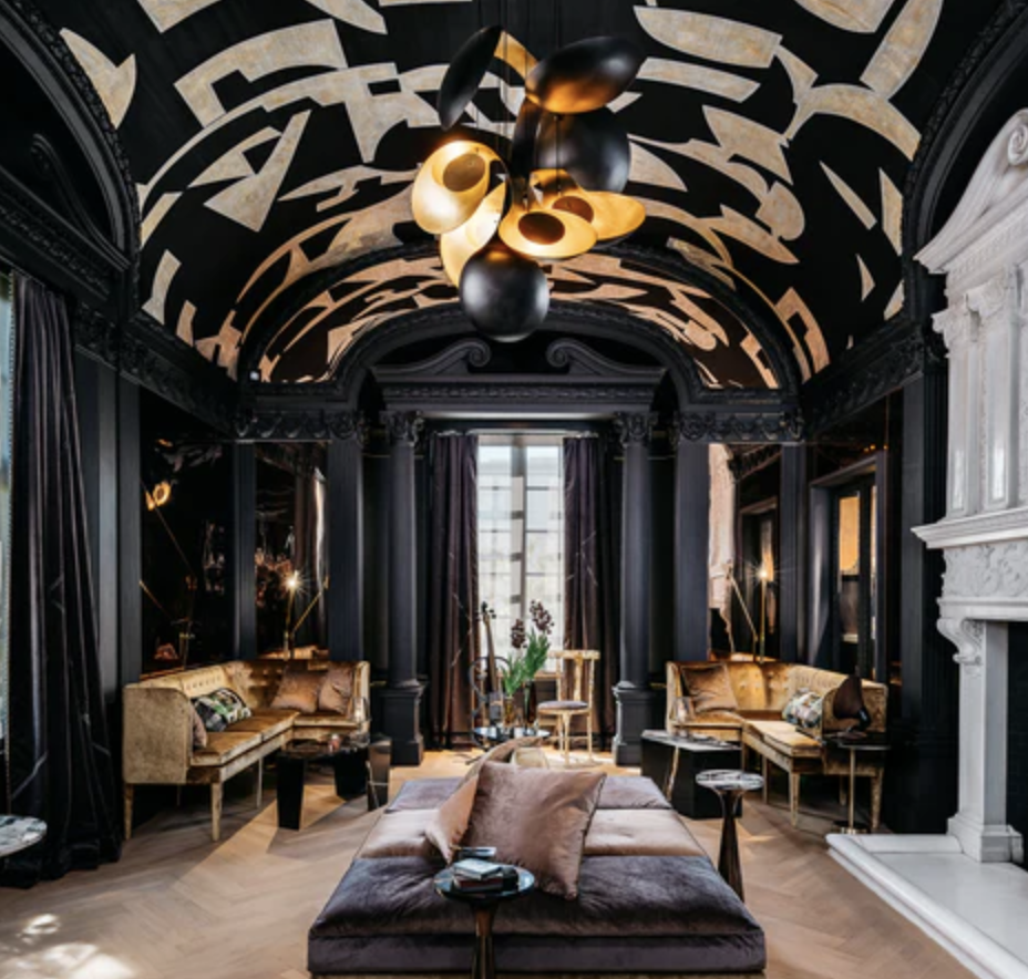
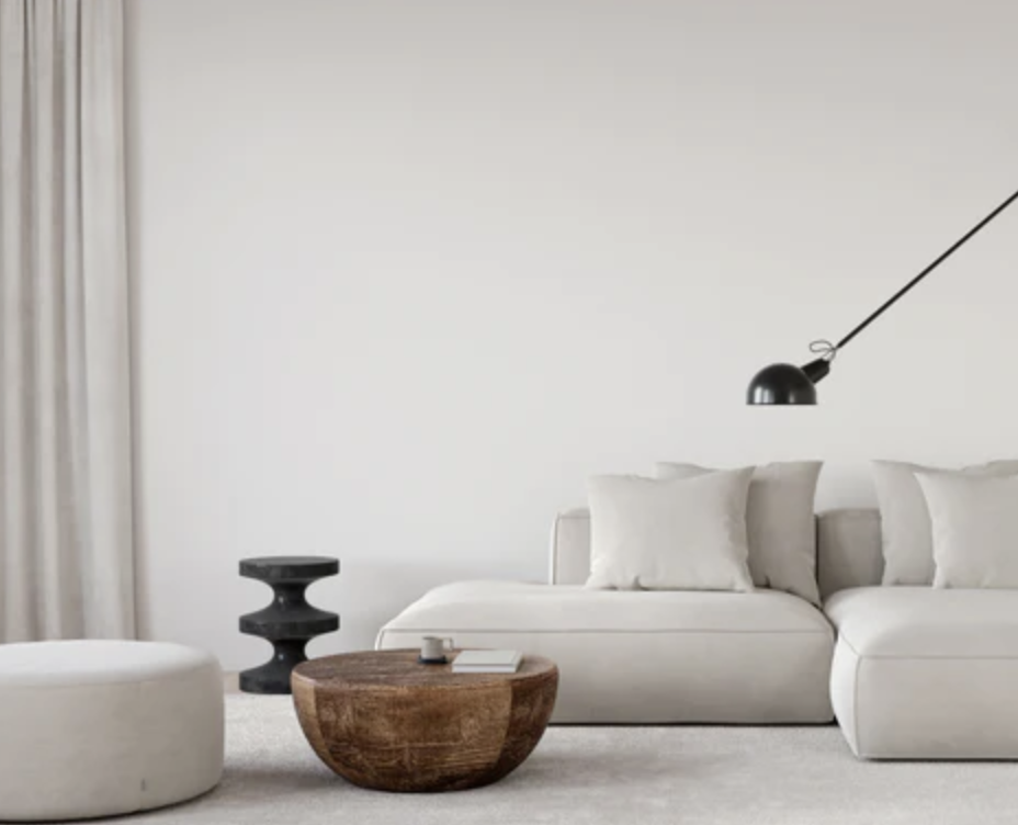
Two additional colors, Stout (C2-965), a full-spectrum near-black, and En Pointe (C2-851), a graceful off-white, present a grounding canvas for any interior.
C2Paint’s Color of the Year - Tiramisu
Benjamin Moore
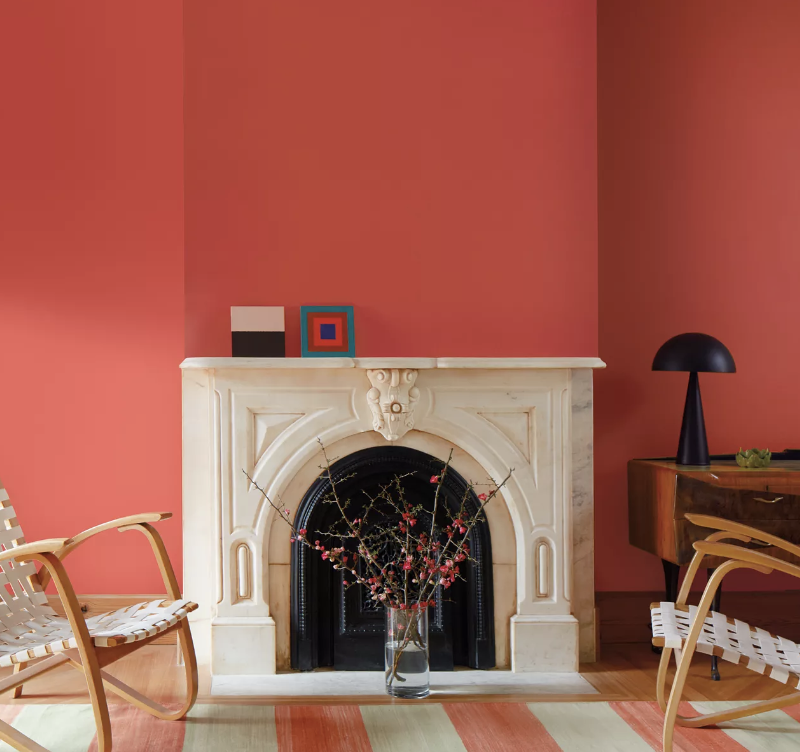
Benjamin Moore’s takes center stage with their Color for 2023. A bold coral-orange, Raspberry Blush (2008-30) is an “unapologetic, vivacious color” inspired by electro-funk duo Chromeo, to underscore the upbeat and optimistic tone of self-expression—much like music. Ben Moore even partnered with the musical artist who produced a song titled by the same name.
Who inspired whom, I wonder?
This color would be fantastic in a dining or powder room.
Pair it with White Heron (OC-57) or Onyx (2133-10) for a dramatic “wow” effect.
Listen to Chromeo’s “Raspberry Blush” on Spotify for a true color experience!
Sherwin Williams
Redend Point (SW-9081) is Sherwin William’s Color of the year. Similar to C2’s Tiramisu, Redend Point is calming, cozy and soulful. It has an earthy-tone like red clay and is versatile for any space. Pair it with Carnelian (SW-7580) and Pure White (SW-7005) for a rich look.
Behr Paint
Behr Paint should know better. Their color of the year, Blank Canvas (DC-003) is not technically a color, but a shade (white and black are not part of the color wheel and all designers know this). Nevertheless, Blank Canvas is a beautiful, warm white and can be paired easily with the rest of their designer collection of soft pastels. This shade of white is classic, yet warm and rich and embodies sophistication.
Valspar
Welcome to Valspar’s Color-Verse where you can immerse yourself in their metaverse. This is the future, folks! Check out their color(s) of the year inside a house with a Paint Wing, Game Wing and Art Wing. Click on any of their “nature-inspired” colors and style the walls of your choosing and toggle, spin around, or create your own Naturescape in the Art Wing. The Game Wing is a dash to DIY elements that eventually earn you points and lead you on an adventure to Lowes where you can purchase the paint.
Creative and entertaining, but I’m not a fan.
One color that is truly beautiful and bold is their jewel-tone Everglade Deck 5100-3 , a “midnight blue that is calming, elegant and creates a restorative space for our mind, body and home” explains Sue Kim, Color Marketing Manager at Valspar. Pair it with brass as seen in this picture from the Valspar website.


